🤏 Cell-Cell Interaction / Proximity / Co-Occurance Analysis
The sm.tl.spatial_interaction function calculates the likelihood of cell types being adjacent to each other, compared to a permuted background, and supports 3D data. This analysis is based on cell centroids, with the option to determine neighbors either by a) a radius from the cell centroid or b) a fixed number of nearest neighbors. The measurement units depend on how the X and Y coordinates are computed. I recommend setting a neighborhood radius between 50-100 microns. By default, MCMCIRO stores XY coordinates in pixels, necessitating a conversion from pixels to microns, which varies based on magnification, binning, and other settings during image acquisition.
1 2 3 | |
Running SCIMAP 1.3.14
1 2 | |
Run spatial interaction tool
1 2 3 4 5 6 | |
Processing Image: ['exemplar-001--unmicst_cell']
Categories (1, object): ['exemplar-001--unmicst_cell']
Identifying neighbours within 70 pixels of every cell
Mapping phenotype to neighbors
Performing 1000 permutations
Consolidating the permutation results
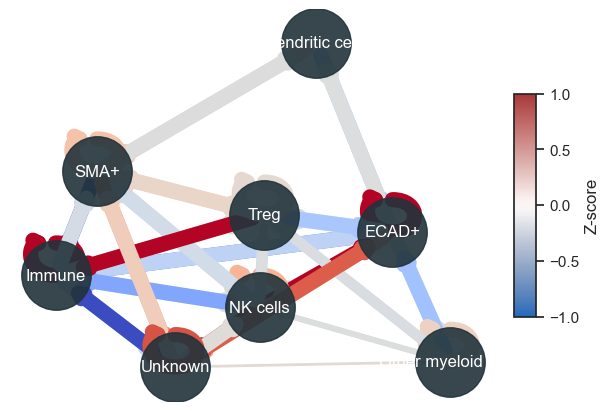
Let's take a look at the results
1 2 3 | |
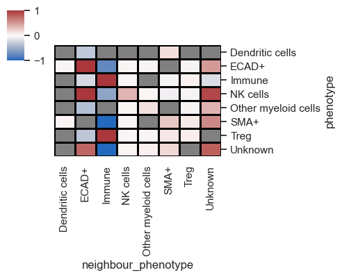
In the depicted plot, red and blue signify the likelihood of two cell types being adjacent to each other, while grey denotes interactions that lack significance.
It's important to understand that when analyzing multiple images, the results represent an average across all the images involved. Since the demo contains only one image, to simulate multiple images, let's once again utilize the ROIs, treating them as distinct images for analysis purposes.
1 2 3 4 5 6 | |
Processing Image: ['Other']
Categories (1, object): ['Other']
Identifying neighbours within 70 pixels of every cell
Mapping phenotype to neighbors
Performing 1000 permutations
Consolidating the permutation results
Processing Image: ['ROI3']
Categories (1, object): ['ROI3']
Identifying neighbours within 70 pixels of every cell
Mapping phenotype to neighbors
Performing 1000 permutations
Consolidating the permutation results
Processing Image: ['ROI1']
Categories (1, object): ['ROI1']
Identifying neighbours within 70 pixels of every cell
Mapping phenotype to neighbors
Performing 1000 permutations
Consolidating the permutation results
Processing Image: ['ROI2']
Categories (1, object): ['ROI2']
Identifying neighbours within 70 pixels of every cell
Mapping phenotype to neighbors
Performing 1000 permutations
Consolidating the permutation results
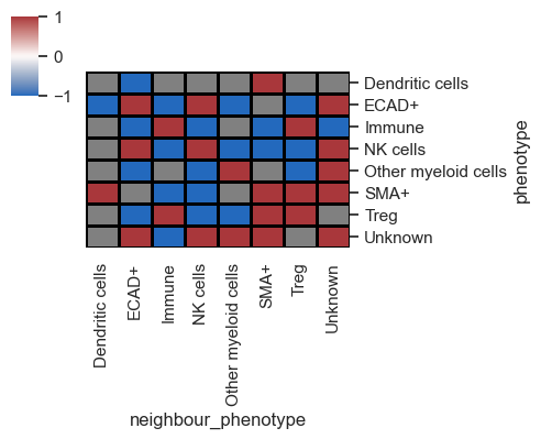
1 2 3 4 | |
This reflects the average across the images (in this case, ROIs), but let's now proceed to visualize the data for each image individually by adding summarize_plot=False
1 2 3 4 5 | |
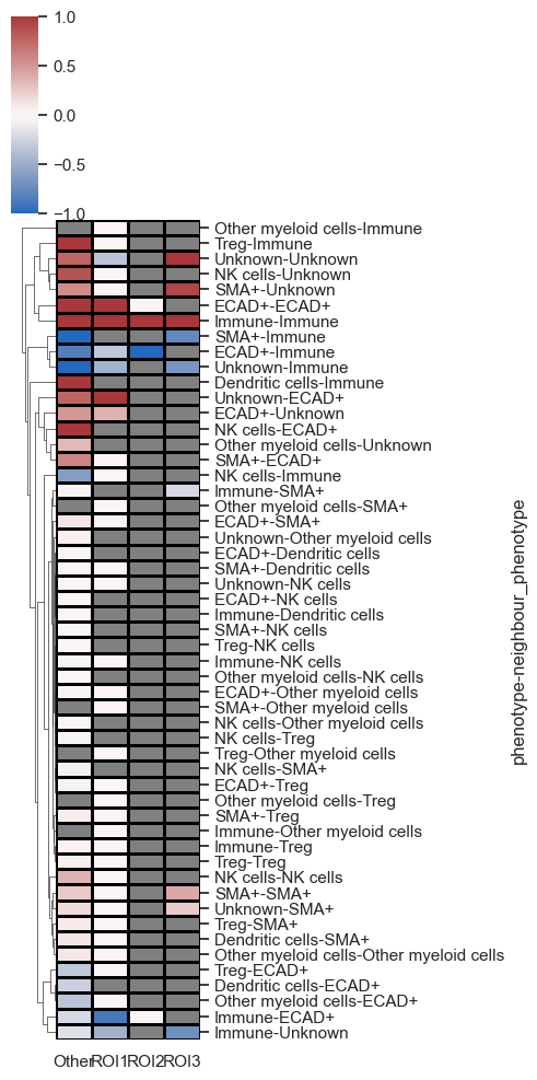
As seen above, each image (ROIs) is represented on the x-axis, with all pairs of interactions featured on the y-axis. The data is clustered, enabling the identification of the most significant interacting pairs across the images.
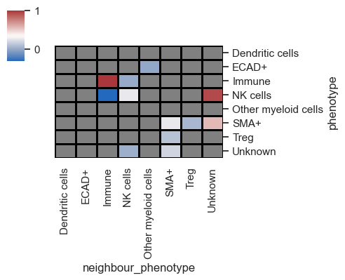
You can also set subset_phenotype and subset_neighbour_phenotype to specifically display only cell types of interest, which is particularly useful for publications.
Lastly, let me introduce a parameter named binary_view. When set to True, this parameter binarizes the heatmap, omitting the z-scores for simpler interpretation.
1 2 3 | |
Typically, I combine this with distance plots to understand cell distribution across the tissue. Utilizing both distance and interaction plots together effectively highlights interacting cell partners in manuscripts.
1 2 | |
/Users/aj/miniconda3/envs/scimap/lib/python3.10/site-packages/scipy/stats/_stats_py.py:9694: RuntimeWarning:

divide by zero encountered in log
Save Results
1 2 | |
1 | |