Animate with scimap
1 2 3 | |
Preparing Data
The objective is to create an animation showing transition between UMAP plot and XY coordinate plot in spatial data.
Let us use the same data that we used in the previous tutorial.
1 2 | |
1 2 3 4 | |
Loading unmicst-exemplar-001_cell.csv
All you need to be aware of is that you would need the XY coordinates in adata.obs. Check out the first two columns below.
1 | |
| X_centroid | Y_centroid | Area | MajorAxisLength | MinorAxisLength | Eccentricity | |
|---|---|---|---|---|---|---|
| unmicst-exemplar-001_cell_1 | 1768.330435 | 257.226087 | 115 | 12.375868 | 11.823117 | 0.295521 |
| unmicst-exemplar-001_cell_2 | 1107.173913 | 665.869565 | 92 | 11.874070 | 9.982065 | 0.541562 |
| unmicst-exemplar-001_cell_3 | 1116.290323 | 671.338710 | 62 | 9.995049 | 8.673949 | 0.496871 |
We already have one of the coordinate systems in place (i.e. the XY system). Let us generate the other coordinate system. We are going to perform UMAP but you can use any other method such as PCA or TSNE etc...
1 2 | |
OMP: Info #270: omp_set_nested routine deprecated, please use omp_set_max_active_levels instead.
1 | |
If you are interested to know where the umap results are stored, it is in adata.obsm.
You might also need to know this if you plan to pass in your custom coordinate systems. You could save your custom coordinates as a 2D array in adata.obsm and call it in the sm.hl.animate() function
1 2 | |
array([[ 5.8368936,  5.994031 ],
       [ 7.6336074,  8.640663 ],
       [ 7.0792394,  8.212058 ],
       ...,
       [ 9.53943  , 11.315233 ],
       [ 8.265402 , 12.259403 ],
       [ 5.8973293,  6.0002956]], dtype=float32)
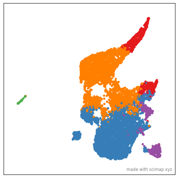
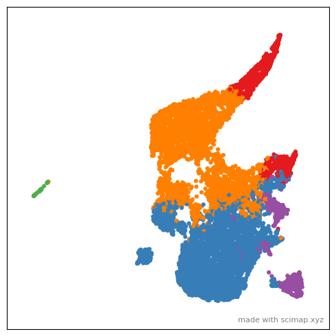
Now that we are set with both the coordinate systems can create the animation. However, it may be still a bit dull as we do not have intersting way to color the plot. A common way to color a plot is by its cell-types. As I had showed previously, you could use scimap's cell phenotyping method to identify cell types. For simplicity let us cluster the data and color by those clusters.
1 2 | |
Kmeans clustering
1 2 | |
1    5050
4    4345
0     996
3     703
2      76
Name: kmeans, dtype: int64
As you can see above we have identified 5 clusters.
Time for Animation
Here is the documentaion for all the parameters that are available within the animate function. Something to keep in mind is that not all IDE's are able to render the animation and so I highly recommend saving the animation to disk before viewing it. As saving takes quiet a long time, I generally optimize the look of the animation by subsampling the data. Sometimes jupyter notebook just renders a still image and so that might also help with optimization.
1 | |
Let us now save the animation to disk. In order to save the animation you would need something called imagemagick installed on your computer. Please follow this link to install it.
To save the animation to your disk pass, the path to the location, along with the file name like so: save_animation = "/path/to/directory/my_figure"
1 2 | |
Saving file- This can take several minutes to hours for large files
You might notice that the gif images are quiet large. I will add supoort to saving as mp4 soon.
I generally use some online tool to convert it to mp4 for reducing the file size.
There are a number of parameters to play around with to customize the look of the animation. Check out the documentation for more details.
1 2 3 4 5 6 7 | |
Please note you can only plot one image at a time as in most cases the XY are unique to each image. If you are working with a dataset with multiple images, please use the subset parameter to subset the one image that you want to plot. As I mentioned earlier use the subsample parameter to optimize the feel of the plot.
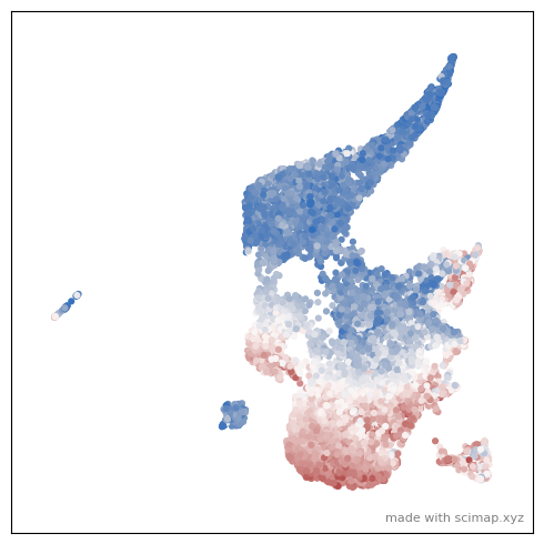
You could also color the plot by expression of a particular marker by using and these parmaters control different aspects of it use_layer=None, use_raw=False, log=False
1 | |
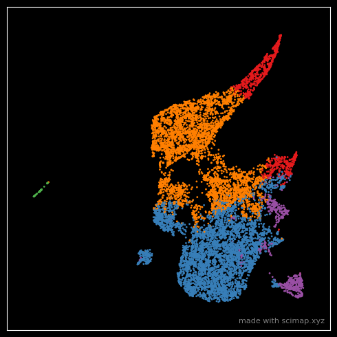
Use n_frames=50, interval=50, reverse=True, final_frame=5 to control the smoothness and duration of the animation. You can also change the theme/ background of the plot using the pltStyle=None paramater.
1 | |
Note that I changed the dot size with s=1 in the above plot. If you think that is still large, increase
the size of the entire figure using figsize = (25,25) which will retrospectively make the points smaller.
Happy Animating.
I would love to see what you create. Tag me on twitter.